What is data visualization and why is it important? [Definition & Examples]
Data visualization is the practice of translating information into a visual context, with the goal of providing the viewer a qualitative understanding of the information. Visualizing data reveal trends and insights that would otherwise remain obscure and help data analysts and data scientists communicate their findings with nontechnical stakeholders.
We don't cook to just eat, we cook to taste. Which is not limited to our mouth, but also extends into beautiful presentation for our eyes.
Why is DATA visualization important?
Data isn’t tangible and can’t be seen, but you can see a representation of it. Pundit Stephen Few describes it very beautifully in the The Encyclopedia of Human-Computer Interaction, data visualization allows us to “find a way to give form to that which has none”.
Our brain processes visual data faster and understands it better than text. Think about trying to determine the most sold item in your shop: the bestseller can be quickly found on a pie chart instead of looking in rows and columns of numbers on a table.
BeforeAfter
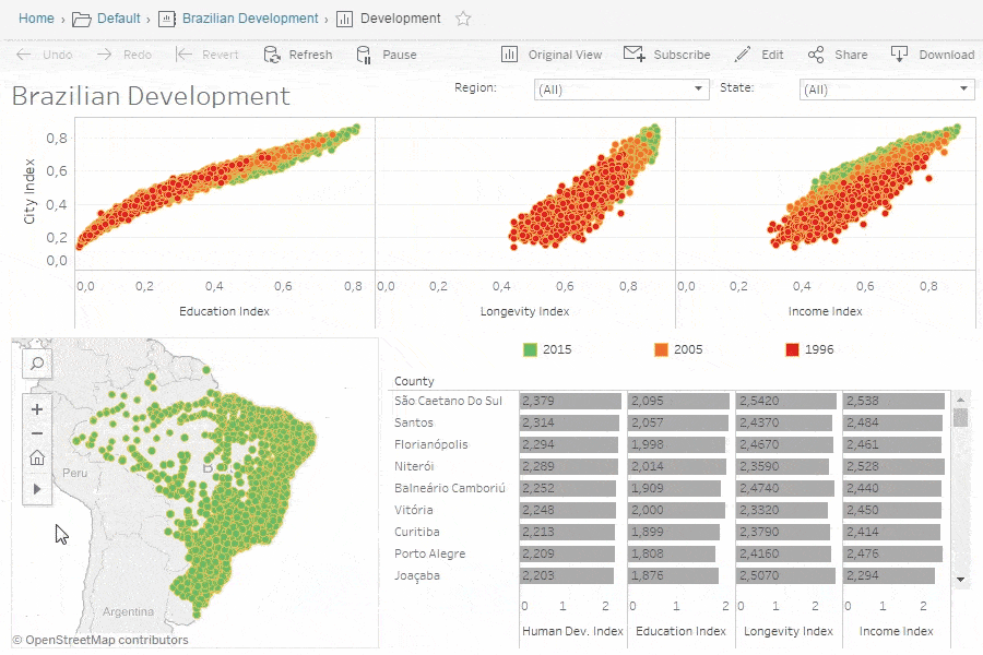
Example visualization of the Brazilian Development dataset of every city created in tableau.
Benefits of data visualization
The biggest benefit of visualization is it’s natural overlap with our human brain processing. This provides:
a quick form of communication;
a faster and easier understanding in data; a
an increase of decision-making speed;
a reduction of the chance of mistakes;
Data visualization: 4 best practices
Visual communication should be simple and straight-to-the-point. This will help your audience to consume the information and arrive at your conclusion much easier. In order to achieve this, we’ve set 4 best practices which’ll help you to create great dashboards:
1. Set the context
Always keep in mind to focus on providing clear information to your audience. By setting the context with assisting data such as targets or benchmarks, you create a position for your audience to understand why this data is important to take into consideration.
Example: if the email opening rate is low, we can illustrate this rate compared to the openings rate in the industry. Which will display and prove the underperformance in this marketing channel.
2. Know your audience(s)
Get to know your target audience. Ask questions in order to understand them.
What do they try to achieve?
What are they concerned about?
What are their needs?
The data provided should encourage your audience to take action and not just to beautify a dashboard. If you are unsure about the clearness, just ask your audience. At the end, they know best what information they need to take action.
3. Choose a Correct visual
Make sure the visuals actually help the viewer understand your main points. Inconsistencies in visuals / data can do the opposite and confuse the audience. Every type of visual is designed with a specific goal in mind and therefore needs specific data to achieve these goals..
Example: a scatter plot correctly shows the relationship between two variables.
Example: a line chart correctly shows time series data.
4. Keep it simple
Visualization tools make it easy to add any form of information. But only because you can do it should not mean you have to do it! Keep it simple is the key. Ask yourself during the design process:
Do you really need a data label for each bar in a bar chart?
Do you need different colors to convey your ideas?
Do you use colors that are accessible to a large audience?
Design your data visuals with the focus of maximum impact by eliminating information that can distract your audience.
Data Visualization Catalogue
| Area Chart
| Bar Chart
| BiPartite
| Box Plot
| Bubble Plot
| Bullet Chart
| Column Chart
| Cross Tab
| Donut Chart
| Gauge Chart
| Heatmap
| Histogram
| KPI Card
| Line Chart
| Line Range Chart
| Map Chart
| Pie Chart
| Polar Bar Chart
| Scatter Plot
| Summary Chart
| Table Chart
| Treemap
| Word Cloud
Data Visualization Catalogue
Area Chart
The area chart or area graph is used to display quantitative data. Use it when comparing one to another or more quantities. It is also beneficial for showing trends. Use colors to differentiate variables.
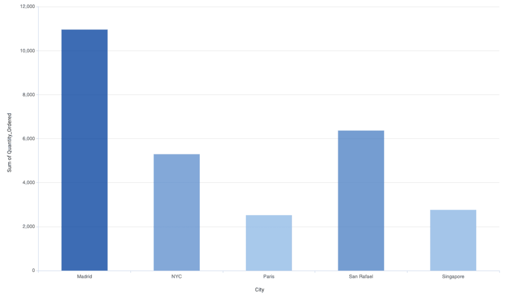
Bar Chart
The bar chart is one of the most often used visualizations. It is generally used to compare different categories and part-whole connections. The bars are placed vertically and differentiated by colors.
BiPartite
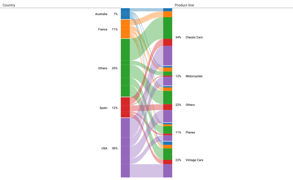
The BiPartite chart is used to show a connection between two categorical variables (columns). With this chart, subsegments can be easily examined.
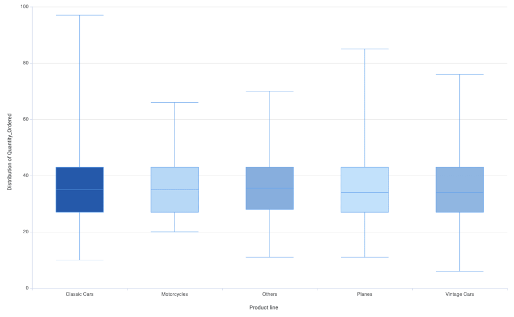
Box Plot
The Box Plot is a tool in descriptive statistics that can help you to get a clearer picture of the distribution and the most important values or outliers in your dataset at the same time.
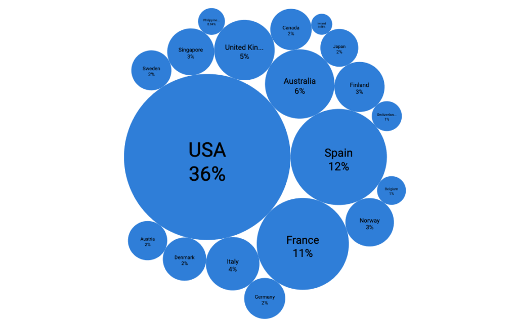
Bubble Cloud
The Bubble Cloud a great tool to show the distribution of categorical values and also add more dimensions by using size and color.
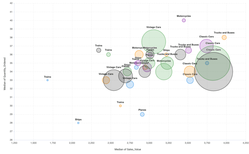
Bubble Plot
The Bubble Plot is a complex chart that is a scatter plot with more dimensions: separations, size, and color. It is used to visualize numerical values that are segmented by different categories.
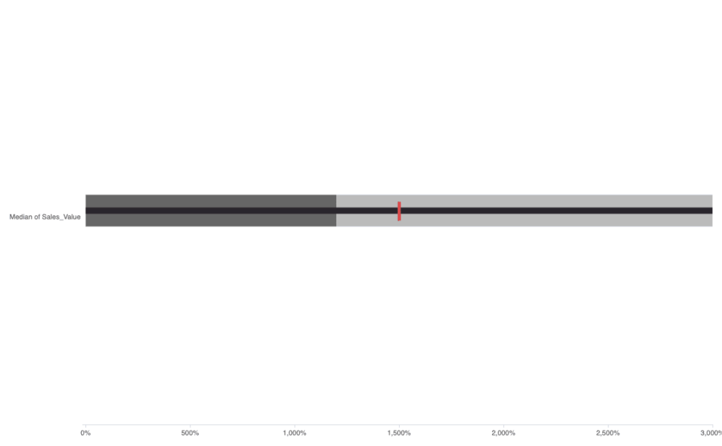
Bullet Chart
The Bullet chart is a variation of the bar chart. It is used to compare multiple KPIs versus the target measure.
Column Chart
The Column chart is very similar to bar chart. It is also used to show distributions, but instead of horizontal bars it uses standing, vertical columns. It is generally used to show changes over time. It can be improved with coloring dimensions.
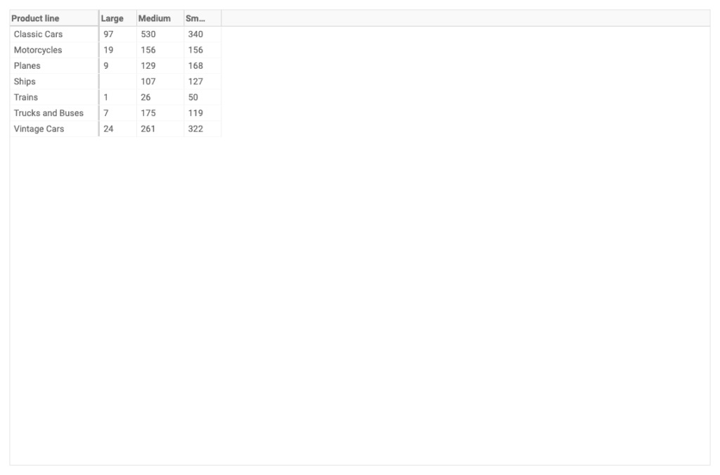
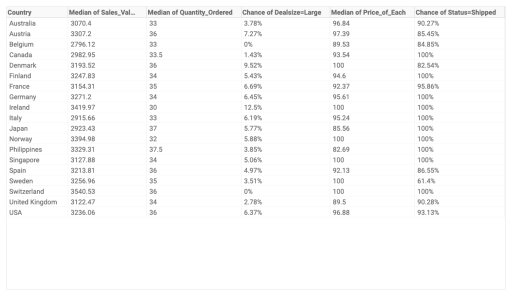
Cross Tab
The Cross tab is a table where two or more variables are cross-tabulated. This is generally used when a chart provides limited information and the audience wants to ‘deep dive’ into more details.
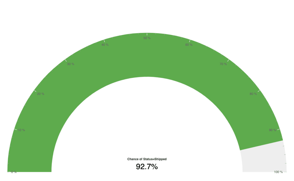
The Gauge chart is or also called speedometer is to show a single value. It can be numerical or categorical value. For numerical values, some kind of aggregations (mean, median, sum) is used. For categorical data, a chance is displayed in percentage.
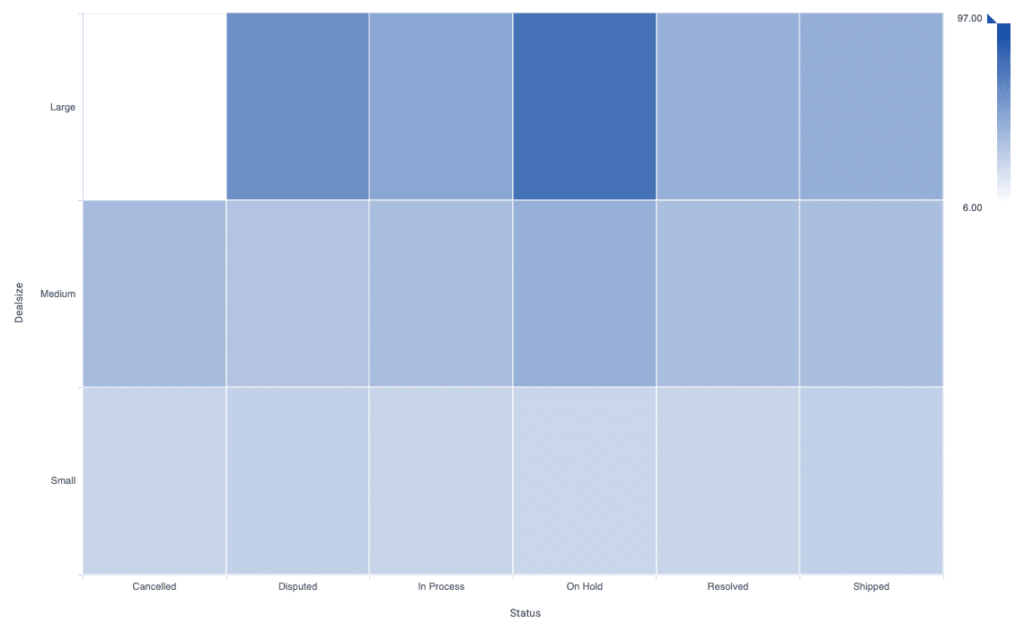
Heatmap
The Heatmap is a data visualization technique that helps to discover focus points and groups in data by using color in two dimensions. The strength of the color shows where the data point are grouped. By default the darker the data the higher the density is.
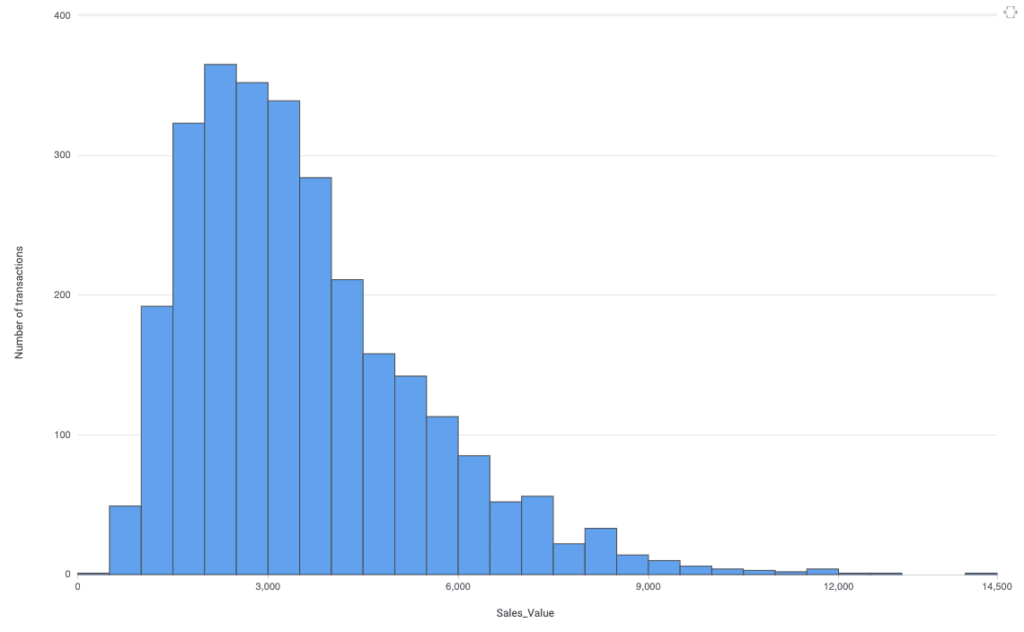
Histogram
Histograms are column-shaped charts, in which each column represents a range of the values, and the height of a column corresponds to how many values are in that range.
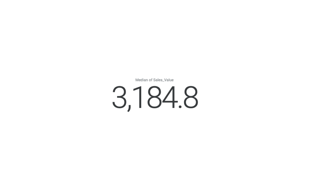
KPI Card
The KPI chart is as simple as it names said. It shows one numerical value, which is mostly a KPI. Sometimes one number tels more than any visualization.
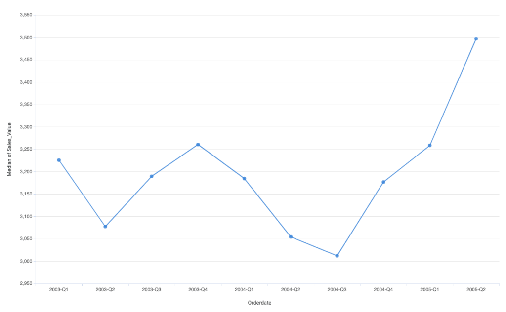
Line Chart
The Line chart is one of the most popular chart types. It is a great graph to visualize time series. On the X-axis can be showed the time from left to right and the Y-axis shows the values. Use it to show trends, changes, or seasonality by time.
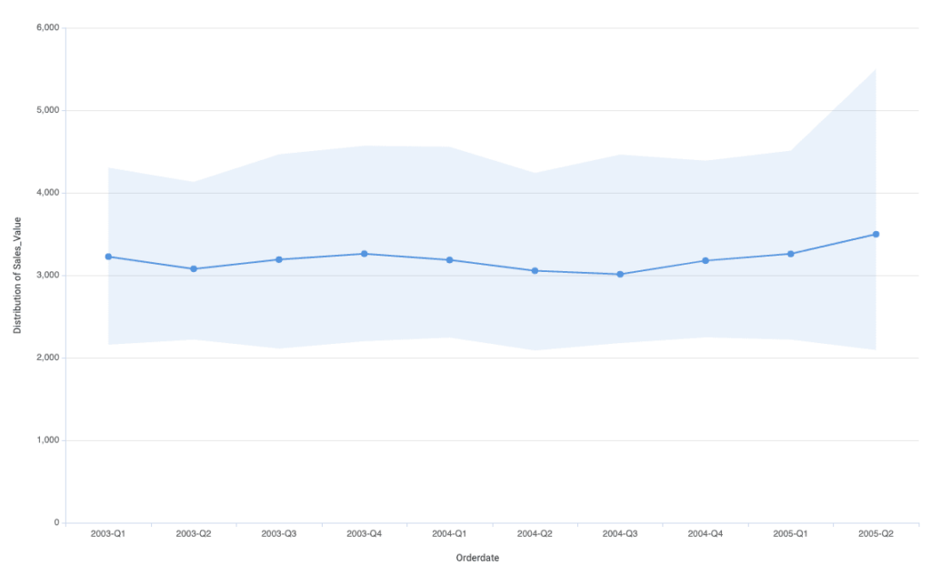
Line Range Chart
The Line Range chart shows almost the same information as the line chart, but it also shows the distribution of the 50% around the average line which helps to understand the distribution. A narrow distribution means little to now deviance.
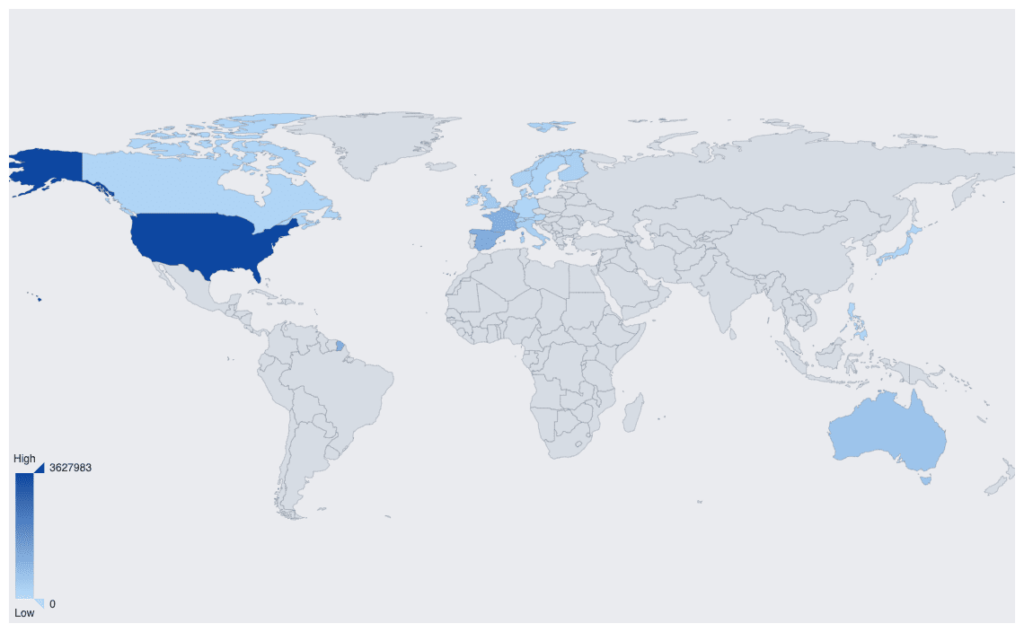
Map Chart
The Map chart shows country, city, or any kind of geographically related aggregations on a map.
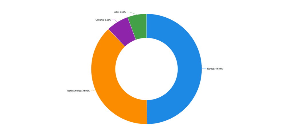
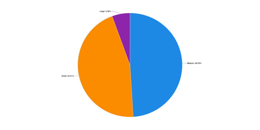
Pie Chart
The Pie chart is one of the most used and misused distribution charts. That shows the distribution of the given data with the size of a “slice”.
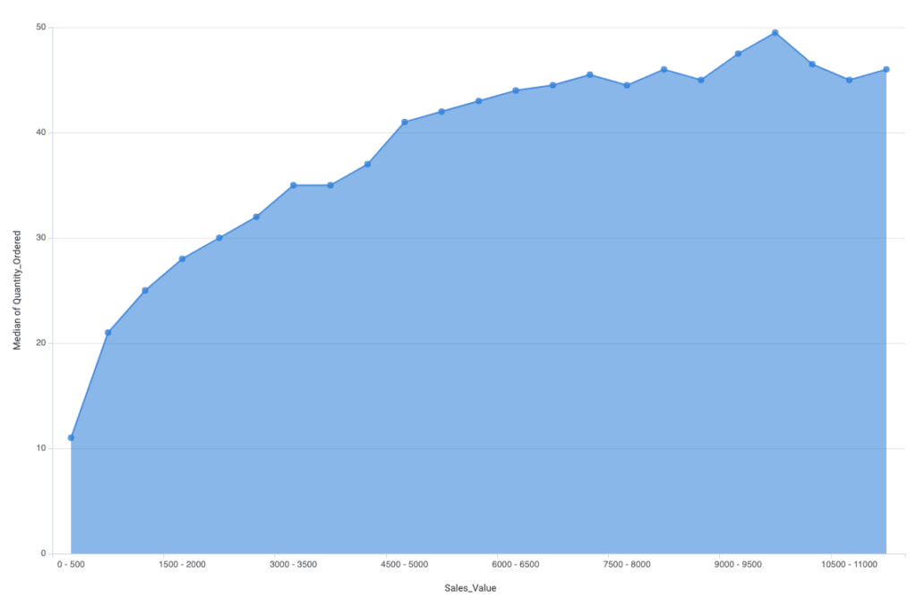
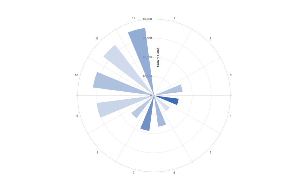
The Polar bar chart is a visualization for date-time and numerical data. It works the best for monthly, daily or hourlyrepresentation of numerical data like sales value, ordered quantity, or other financial data.
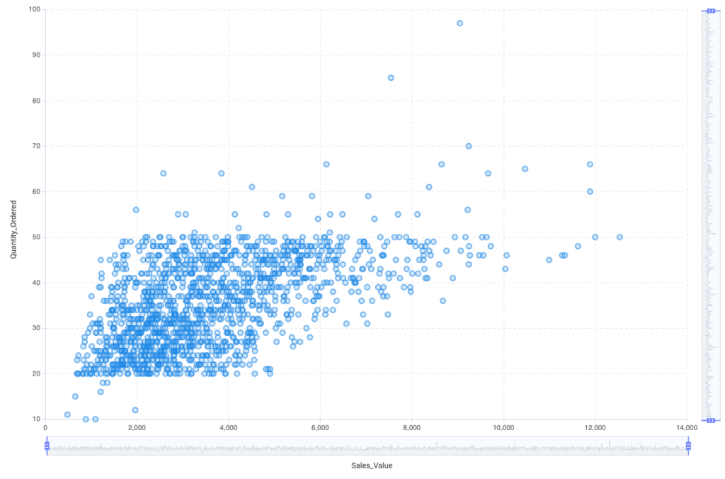
Scatter Plot
The Scatter Plot is perfect to show the correlation between two numerical variables and also show trends. All data points are placed in a two-dimensional coordinate system.
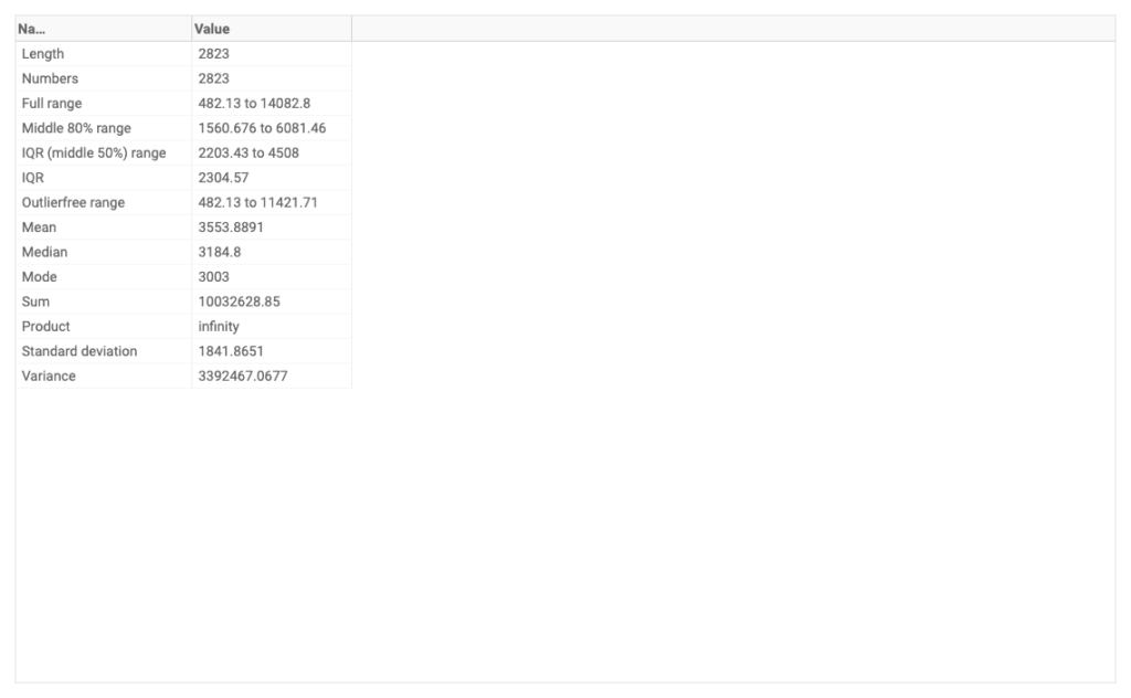
Summary Chart
The Summary chart contains all the important statistical information about the selected column, Range, Average, Median, Standard deviation, and so on.
Table Chart
The table chart is a table where you can create a new aggregation table from the original dataset.
A very similar visual is the matrix chart. The key difference between tables and matrices is that tables can include only row groups, whereas matrices have row groups and column groups.
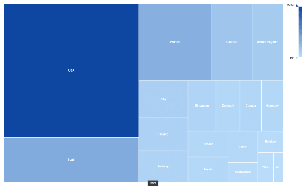
Treemap
The TreeMap is a tool to display distribution with area size. Coloring can be used as an additional dimension.
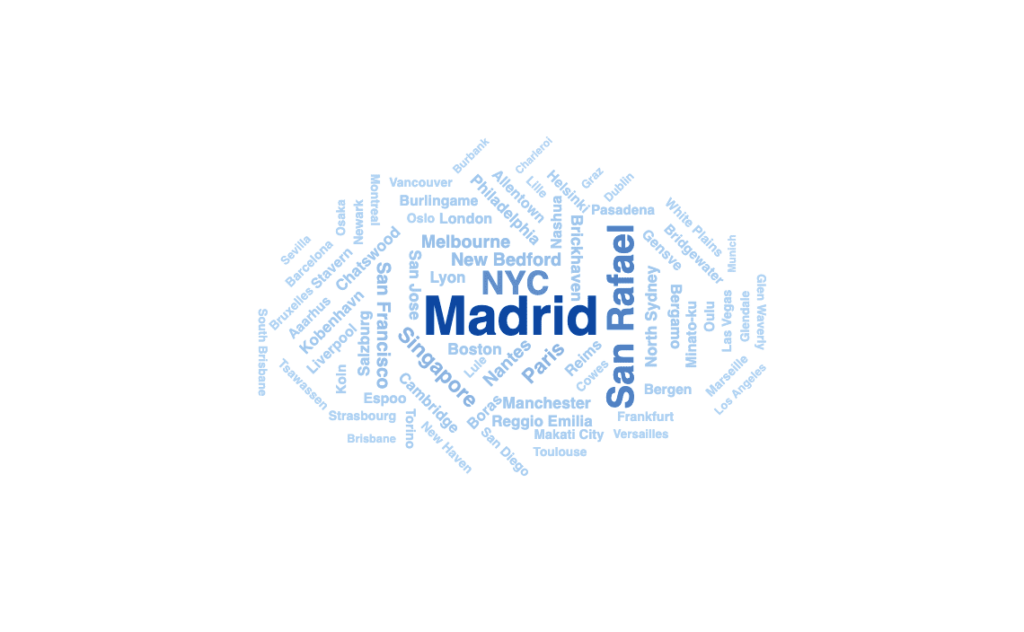
Word Cloud
The Work Cloud is a very good way to highlight a specific category or value. This chart is less informative than other visualizations but looks very good on a dashboard or infographic.