Data visualization has a strong design element to it. Given the differences in domains, applications and audience it’s hard to put a structure around the best way to visualize your data. However, there definitely are wrong ways of doing it! I have come across multitude of such instances which were a driving force behind this post.
In this article I’d like to share some useful tips to help prevent blunders in your visuals.
1. Choose the right visual
This one may seem too obvious! But I have seen several people trying to demonstrate their artistic side for no reason..
Always remember that “form follows function” — purpose of a visual should be the starting point of its design
Ask yourself — are you trying to compare values, show trends, explore distribution or relationship between variables? Then choose appropriate visual(s) depending on the message you are trying to convey.
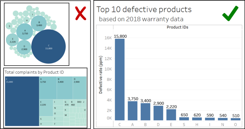
Consider the following charts. The underlying dataset contains product complaints/defects. We are trying to show products that need attention with a defective rate ppm (parts per million) A bar chart is a simple yet effective way to display this data. One of the downside of tree maps and packed bubble charts is that is asks the reader to compare area instead of height which is visually taxing.
Choosing the right visual based on it’s function.
2. Trivial are many but vital are few (data points)
Do not merely slap a visual on the dataset. Analyze and convert your data into an information ‘nugget’ that the audience can grasp.
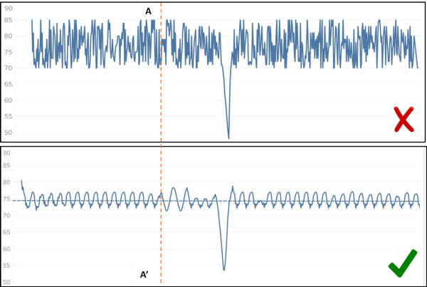
The figure alongside shows a time series chart of a process variable. Line A-A’ shows a point in time when both period and amplitude changed which was the onset of an issue that ultimately led to the sudden dip in its value after a few cycles. Which chart does a better job at uncovering this insight?
The chart on the top simply converts the data into a visual whereas the one at the bottom “conditions” it to provide an insight.
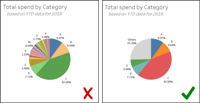
Let’s say that we want to show total annual spend by project ID. There are 41 unique categories. Chart on the left looks crowded with all categories cramped in it. A better way to display this is to show the top 5 categories and combine the remaining into ‘others’ bucket.
Suppressing the “noise” in the data.
Also, beware that filtering out the ‘others’ category may exaggerate the area of the pie chart or change the percent of total calculations. This can be misleading! While displaying percentages, always make sure that they add up to a 100% or explain why and what’s being excluded.
3. Figures don’t lie, but lairs figure!
Visuals should reflect reality and not distort it. Formatting of the chart plays an important role as it sets up a frame of reference for the audience.
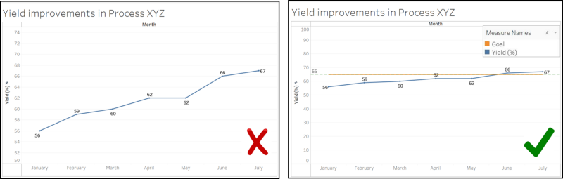
In the example below, the yield of a process increased from 56% to 67% over a period of 6 months. Chart to the left is trying to overstate the improvement by formatting the y-axis to start at 50%. The latter visual paints an accurate picture where y-axis starts off at 0 and also includes a goal line.
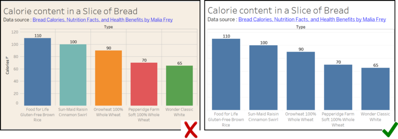
4. Use color wisely
Use of color should be made to add more information or to highlight key data points in a visual. In all other cases, it’s redundant and distracting. This article by Lisa Charlotte Rost has several pointers to consider while choosing a color scheme for your visuals. I would also recommend trying the Viz Palette tool developed by Susie Lu and Elijah Meeks.
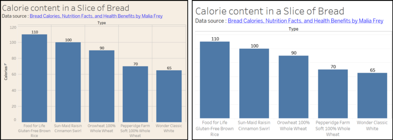
5. How important are aesthetics as compared to functionality?
Visualization tools available today allow us to create most stunning and rich visuals in a few mouse clicks. However, over-doing the aesthetic elements may distract people from the key message of the visuals. One of the seven wastes in the Lean philosophy is ‘Over-processing’.